

small
This block is part of the state ui group and was last modified in core v13.0.6.
small v13.0.6 A small text element.
In pins 4
- Text required
valueThe text of the small element.
- class
uiclassAssigns a CSS class to the element. • Hidden when unused
- style
uistyleApplies inline CSS style to the element • Hidden when unused
- attributes
uiattributesAdds custom attributes to the element. • Hidden when unused
Out pins 1
- state
stateReturns the element to the frontend state.
small text |
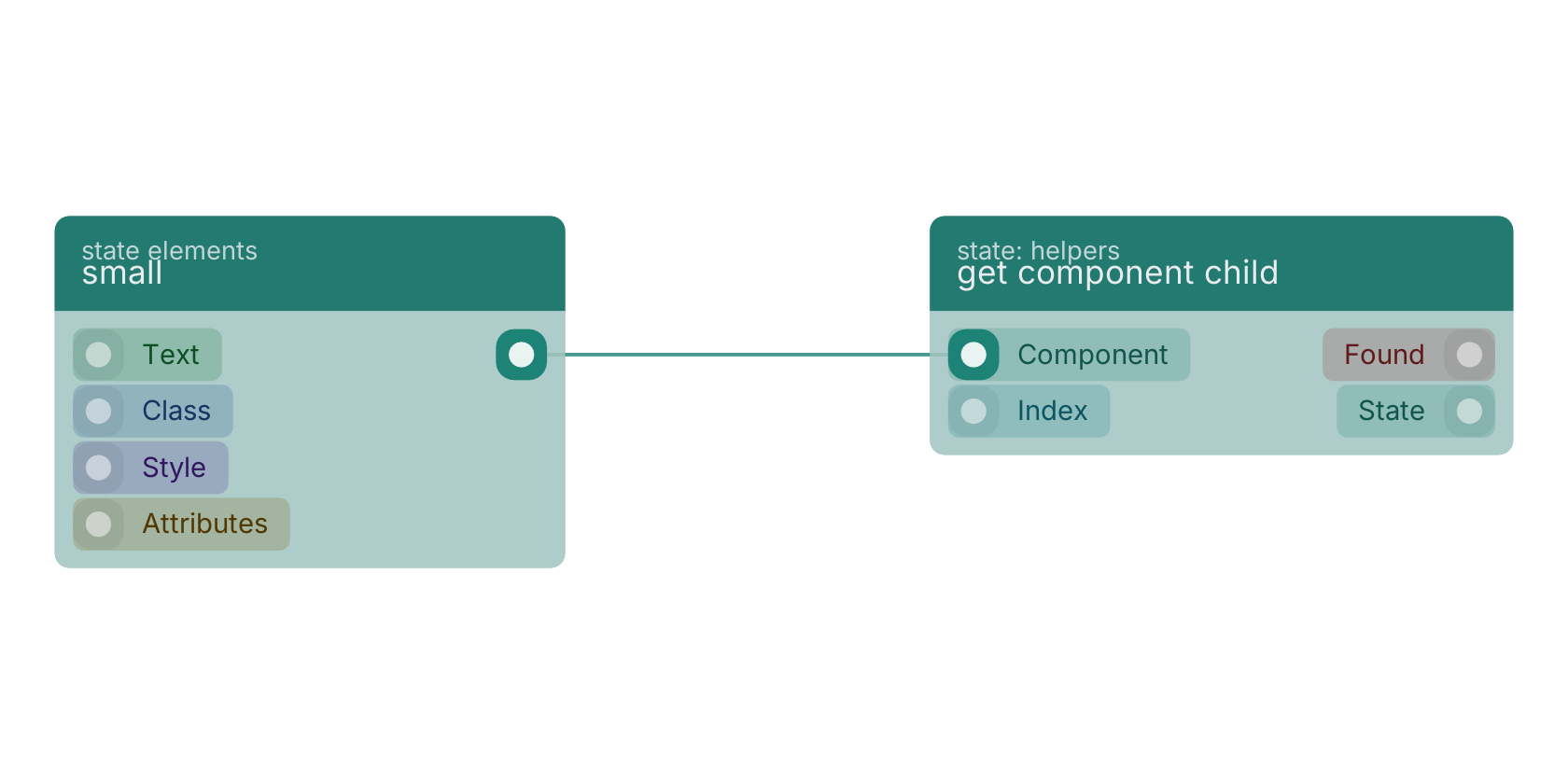
A typical wiring for small: the state out pin feeds get component child.
Version history
Introduced in v13.0.6.
Back to
state ui Return to the main group to view all sub-groups Back to state elements Return to the group to view all blocks within this group